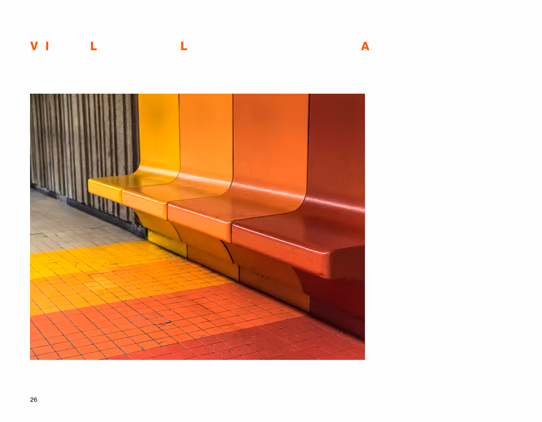
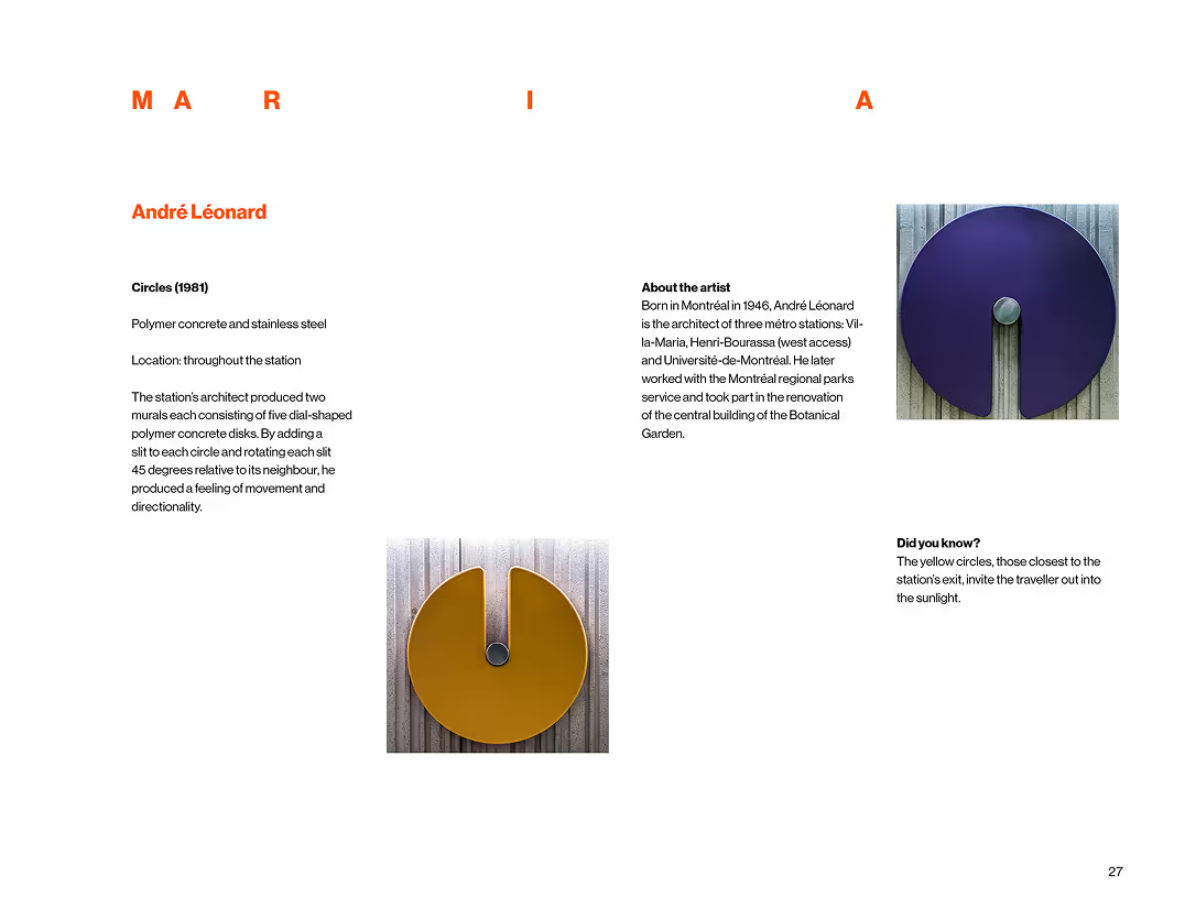
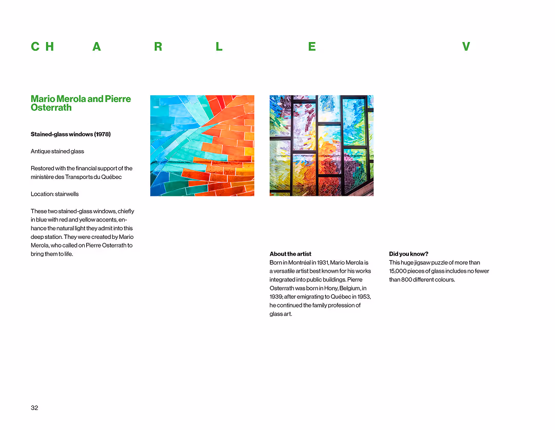
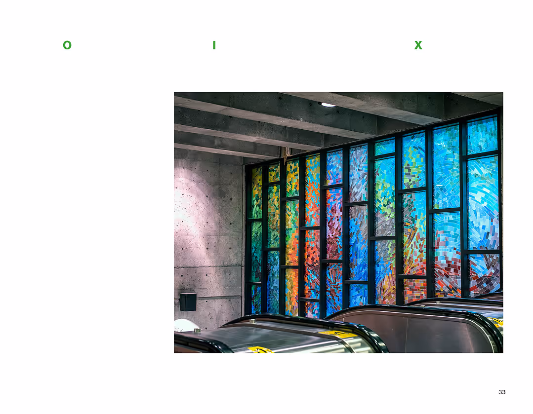
Context
This project focused on editorial design using the STM (Société de transport de Montréal) metro system as subject. The goal was to explore how the visual and spatial elements of public transportation could be expressed through typography, layout, and rhythm.
Challenge
The challenge was to find a visual language that could reflect the STM’s unique identity, without being too obvious or graphic. The system is part of daily life in Montreal, so the design had to feel familiar but thoughtful, and simple but structured. I also wanted to focus on the experience of movement and repetition.
Process
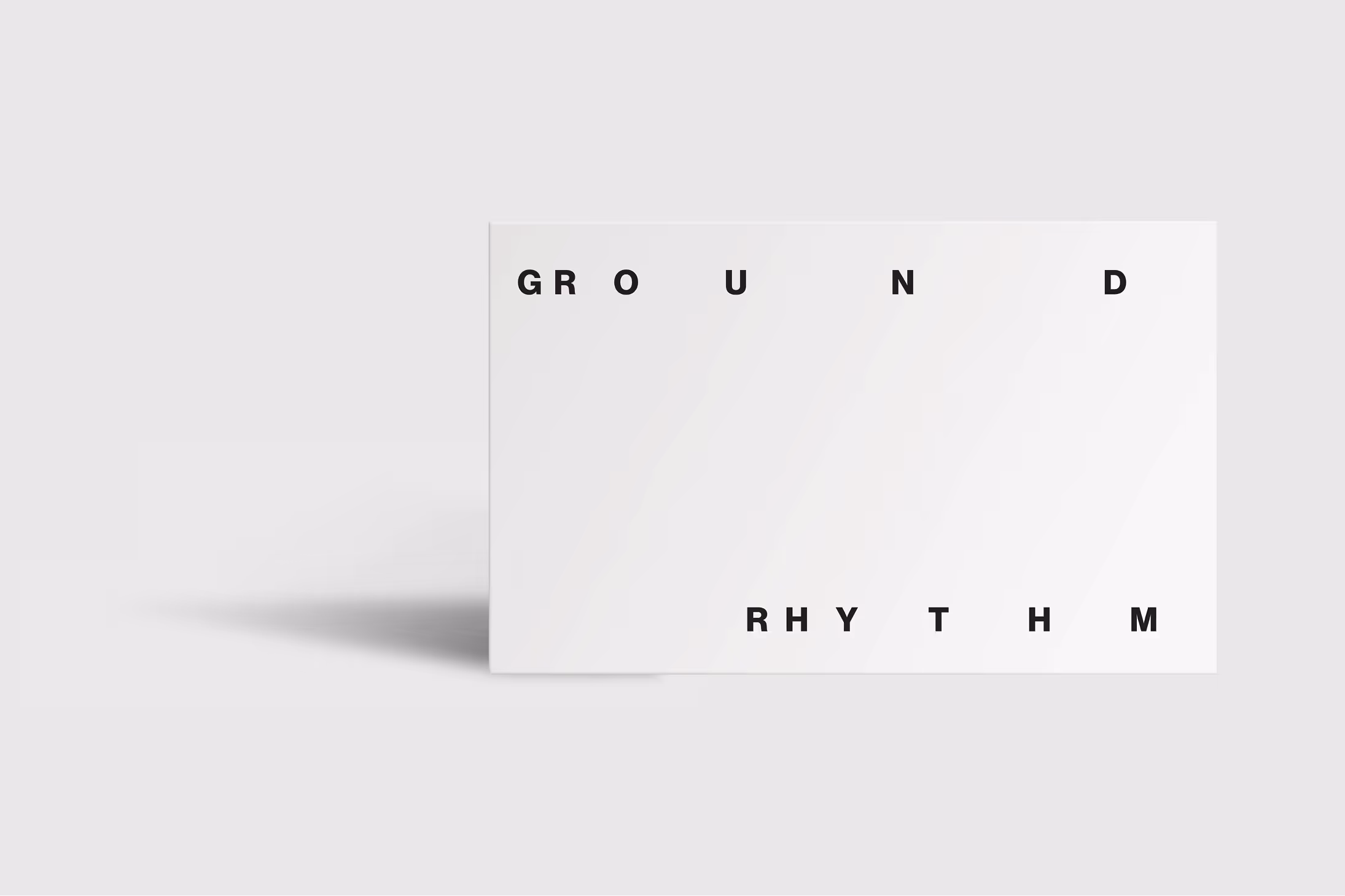
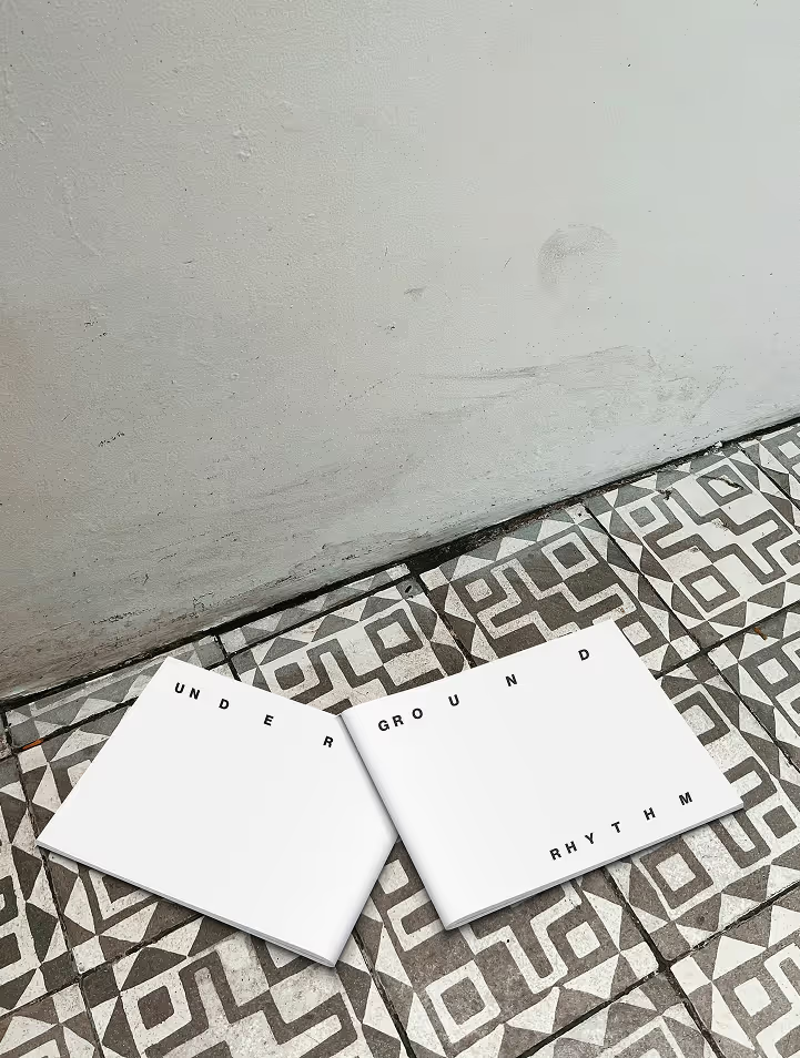
The title Underground Rhythm reflects the core idea: the metro as a system of movement, timing, and flow. The layout plays with spacing and pacing to mirror this rhythm, sometimes tight and fast, sometimes more open and still. I worked with minimal elements, clean typography, and plenty of white space to keep the focus on how the content moves across the page.
Final Design
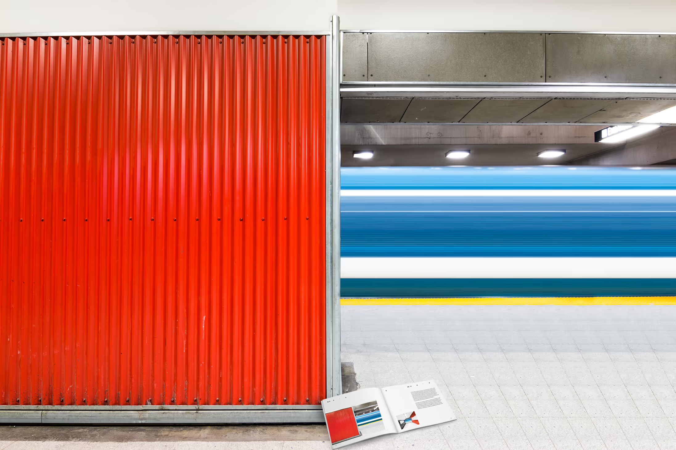
The book is divided into clear visual sections with consistent grids, wide margins, and minimal typographic interventions. Each spread aims to feel like a moment in transit, structured, clear, and rhythmic. The layout emphasizes contrast between movement and pause, text and image, stillness and flow.