Context
This project was an editorial design assignment focused on creating a book about the work of Frank Bowling, a British-Guyanese abstract painter known for blending personal history, geography, and post-colonial identity in his work. I designed both the cover and the layout, using Bowling’s art and themes as the foundation for all visual decisions.
Challenge
We were given layout specifications and structure by our teacher, but the research, concept, and visual execution were up to us. The biggest challenge was designing something that respected and reflected Bowling’s complex body of work. His paintings often explore themes of displacement, colonial history, and memory through abstract maps and layered materials, which meant the design had to be subtle, thoughtful, and avoid overpowering the content.
Process
The title Critical Invisibility came from my reflection on Bowling’s experience as a Black artist working in spaces that often overlooked or minimized his contributions. His work constantly reclaims space, both physically on the canvas and metaphorically in the art world. I wanted the design to support this idea of visibility: letting the artwork speak clearly without distraction, while also nodding to the tension and separation present in his themes.
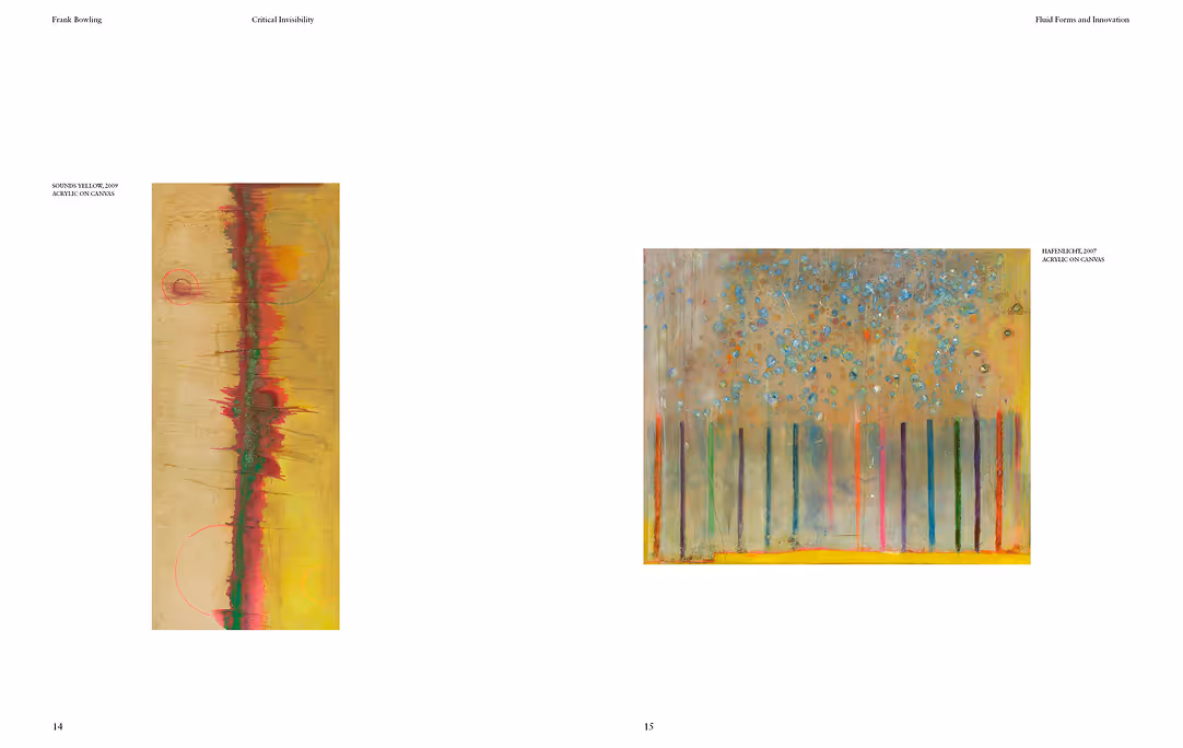
Final Design
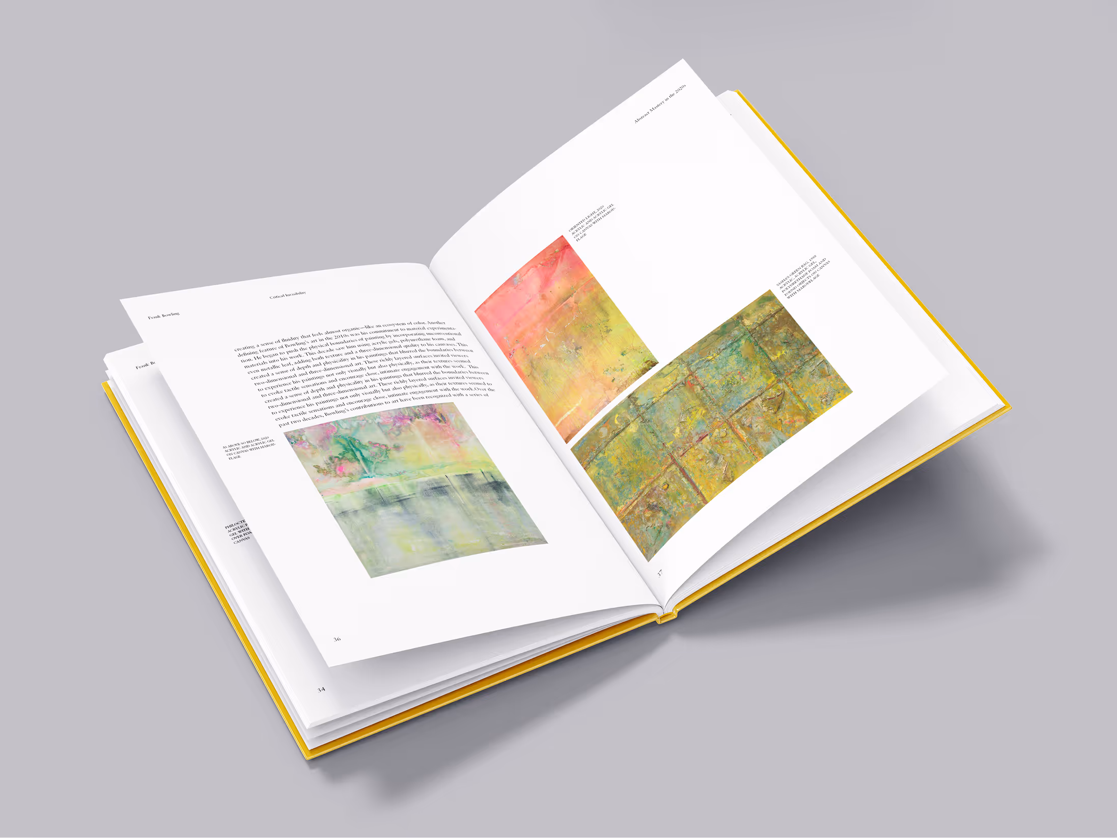
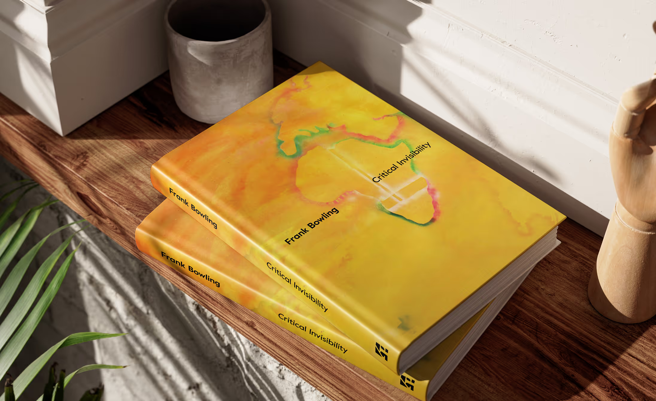
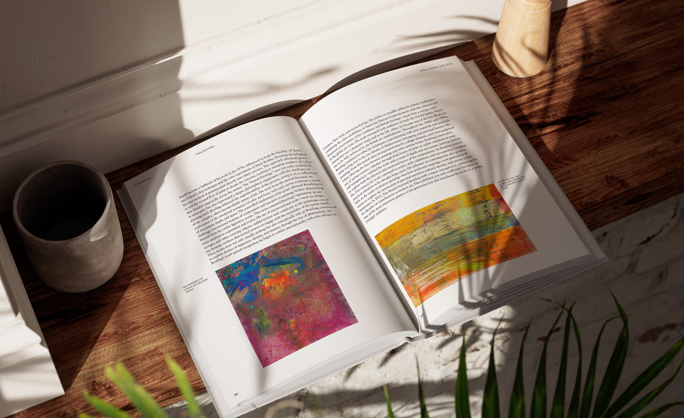
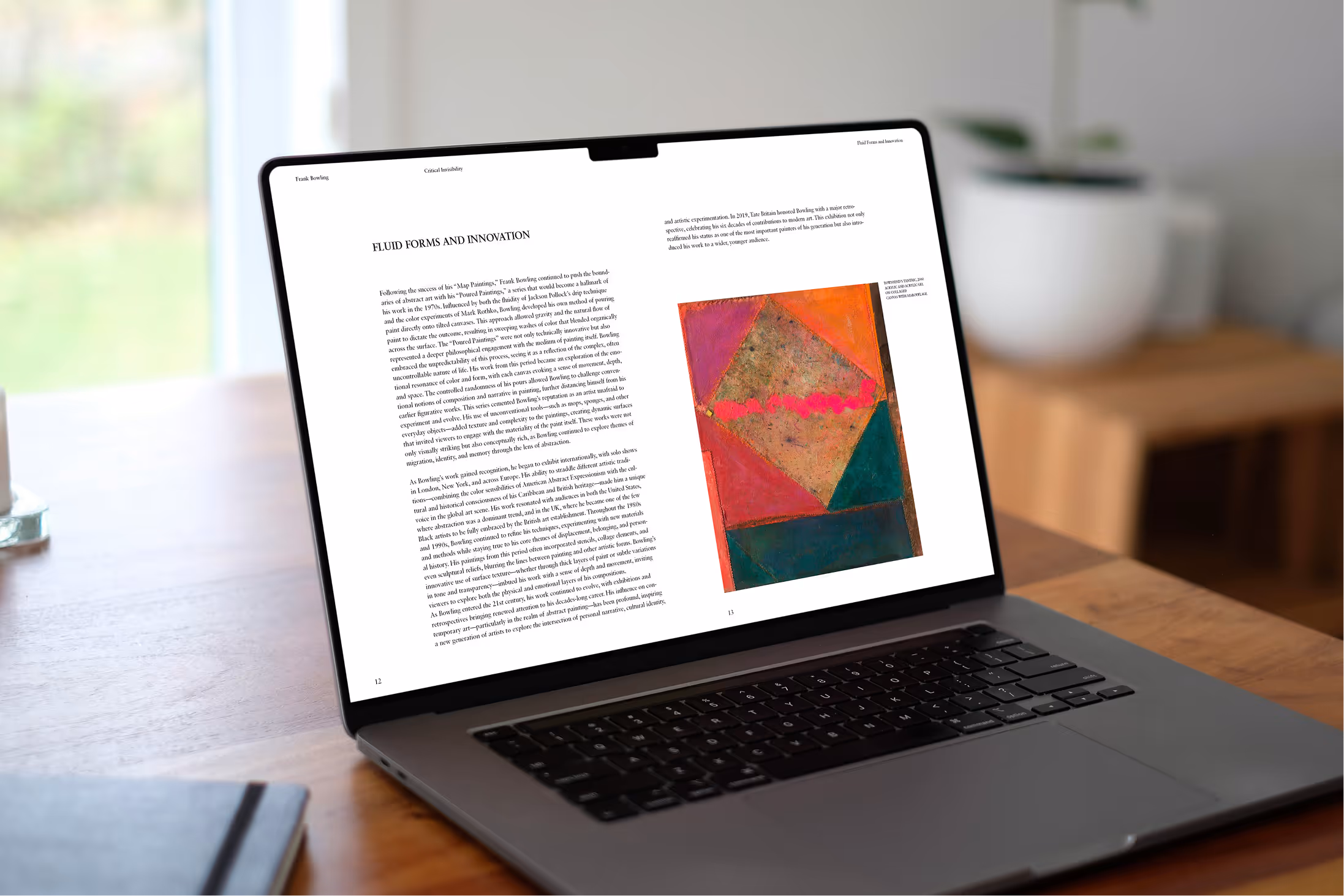
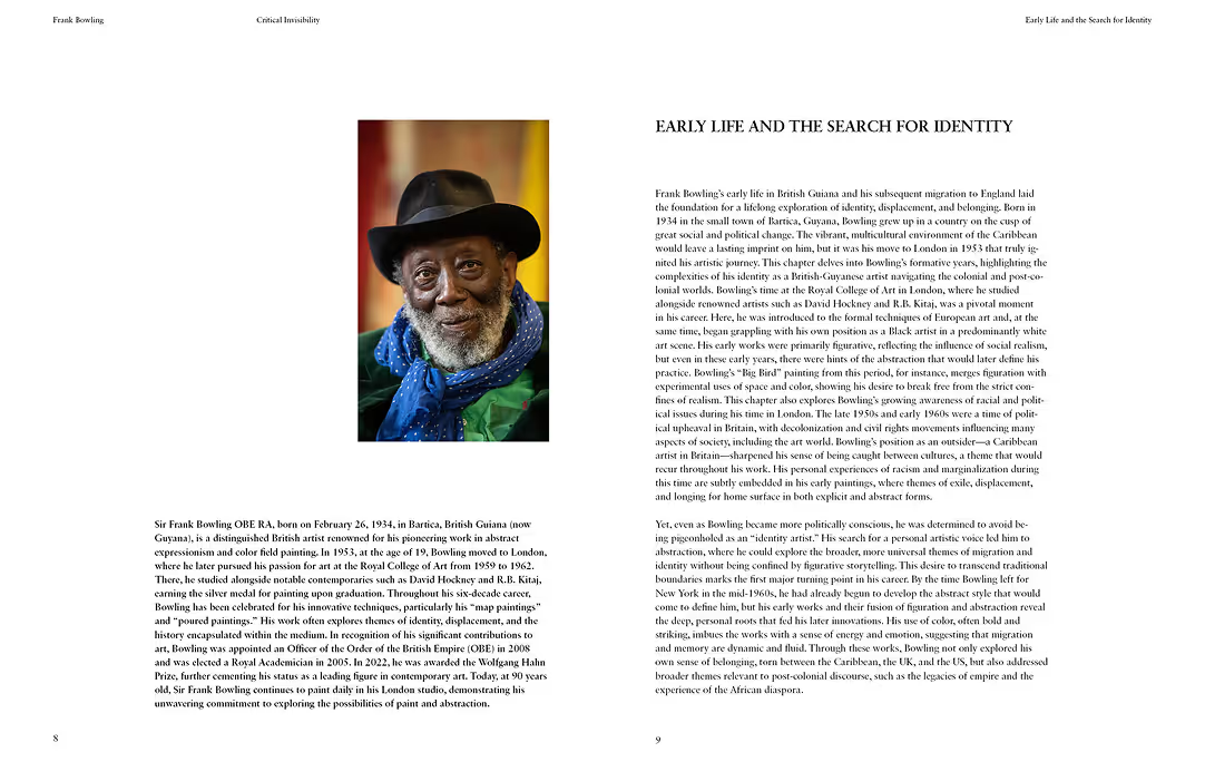
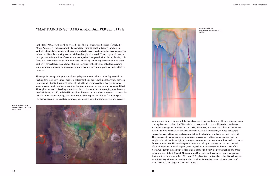
The final book is clean and structured, with a strong sense of rhythm and quietness that gives space for reflection. Each spread is designed to highlight the work without intruding on it. The layout allows the viewer to move through the book almost like walking through a gallery — calm, observant, and uninterrupted. The cover acts as both a visual anchor and a conceptual statement, pulling together the political and poetic sides of Bowling’s work.
For the cover, I selected one of Bowling’s iconic map paintings and placed his name and the title on the same baseline but spaced apart, symbolizing fragmentation and colonial borders. Inside, I used a minimalist grid system with white space to let each artwork breathe. The typeface was chosen to feel neutral yet grounded, complementing the textures and complexity of the paintings.